12 Blue Cabinets Ideas That Look Premium Not Pricey
Blue cabinets have become one of the most loved design choices for kitchens and bathrooms. They carry a timeless charm, offering a fresh and modern twist while keeping a sense of elegance.
What’s even better is that you don’t need to spend thousands of dollars to achieve the premium look that blue cabinets can bring.
With thoughtful planning, the right shade of paint, and a few clever upgrades, you can turn an ordinary space into something that feels custom and high-end—without draining your savings.
Below, let’s take a deep dive into twelve blue cabinet ideas that prove you can look expensive, even when you’re decorating on a budget.
Each section is designed to help you see the impact, the “why” behind the look, and simple tips to make it happen.
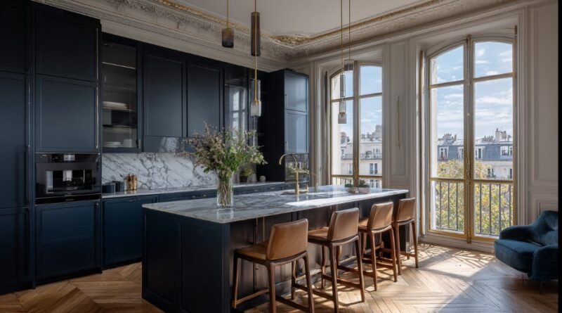
1) Navy Lowers, White Uppers
One of the most classic kitchen trends that instantly adds depth is a two-tone cabinet scheme. By painting your base cabinets navy and leaving the uppers white, you strike the perfect balance between cozy and bright.
The darker bottom cabinets ground the space and hide daily wear, while the lighter uppers keep everything airy and fresh.
Why it looks expensive: Designers often use two-tone kitchens in custom projects because they create contrast and visual interest. It makes your space look “planned,” not accidental.
Budget-friendly trick: Only paint the base cabinets navy. It saves paint, time, and effort, while still giving your kitchen that modern, premium feel.
2) Paint the Island Blue
Not ready to commit to painting all your cabinets? Focus on the kitchen island. A bold blue island becomes the star of the room. It adds personality without overwhelming the space and pairs beautifully with wood floors, marble-look counters, or even butcher block tops.
Why it looks expensive: It feels like a statement piece—something you’d see in a luxury model home.
Budget-friendly trick: Keep your perimeter cabinets neutral, and only invest in a quart or gallon of high-quality paint for the island. Swap out the hardware on just the island to make it pop even more.
3) Dusty Blue for a Soft, Calm Look
If navy feels too bold, dusty or slate blue offers a softer option. These muted tones feel timeless, creating a calm, collected look that works with nearly every style—farmhouse, modern, or traditional.
Why it looks expensive: Muted colors suggest sophistication. They don’t scream for attention; instead, they whisper elegance.
Budget-friendly trick: Always test paint in different lighting. A dusty blue can look gray in dim light or soft turquoise in bright light. A few sample swatches are cheaper than a repainting project later.
4) Satin or Matte Finish (Skip High Gloss)
The finish of your paint can make or break your cabinet project. Glossy paint highlights every dent and brush stroke, making cabinets look cheap if the prep isn’t perfect. A satin or matte finish, however, gives that velvety, furniture-like appeal.
Why it looks expensive: A smooth satin finish creates depth without screaming “DIY project.”
Budget-friendly trick: Use foam rollers for large surfaces to avoid streaks. Two thin coats, with a light sand in between, will give you a professional-grade finish at home.
5) Brass or Brushed Gold Hardware Against Blue
Blue cabinets and warm-toned metals are a match made in design heaven. Swap out old, builder-grade hardware for brushed gold, champagne bronze, or antique brass pulls. Instantly, your cabinets feel curated and high-end.
Why it looks expensive: Hardware is like jewelry for your cabinets—it adds sparkle and character.
Budget-friendly trick: Look for multi-packs of hardware online. Adding small backplates under handles can also cover old screw holes, saving you from having to fill and sand.
6) Add Crown Molding and Light Rail—Painted to Match
One of the secrets to making standard cabinets look custom is trim work. Adding crown molding to the tops of cabinets elongates them and makes them look built-in. A slim light rail under upper cabinets gives the same effect and doubles as a place to hide under-cabinet lighting.
Why it looks expensive: Trim details make even flat-pack cabinets look like they were designed for the space.
Budget-friendly trick: Use MDF or primed wood moldings—they’re cheaper but look the same once painted. Caulk every seam before painting for a polished finish.
7) A Few Glass-Front Doors (Just One Section)
You don’t need to go all-in with glass cabinetry. Replacing just one or two doors with glass fronts is enough to break up the solid blue and add visual interest.
Why it looks expensive: Glass cabinetry creates an airy feel and mimics what you’d see in custom homes.
Budget-friendly trick: If custom glass inserts aren’t in the budget, try frosted adhesive films or reeded glass panels. They hide everyday dishes but still give that upscale touch.
8) Beadboard or V-Groove on Exposed Ends and the Island
Cabinet sides and islands are often overlooked. Adding beadboard or v-groove panels to these spots makes a huge difference. When painted the same blue as the cabinets, these details mimic bespoke millwork.
Why it looks expensive: Texture and shadow lines elevate flat surfaces into something with depth.
Budget-friendly trick: Thin, paint-grade plywood or beadboard panels are affordable. Attach them with construction adhesive and finish nails, then paint everything together.
9) Furniture Feet and a Recessed Toe-Kick
Want your cabinets to feel like custom furniture instead of flat boxes? Adding decorative feet at the corners or recessing the toe-kick creates a more high-end look.
Why it looks expensive: Furniture-style cabinets are often associated with custom design.
Budget-friendly trick: Many home improvement stores sell inexpensive bun feet or square legs. A little paint to match the cabinets ties them in seamlessly.
10) Applied Molding to Fake a Custom Door Style
If your cabinets are flat or have skinny rails, you can add trim to upgrade their look. Applied molding gives the illusion of thicker shaker panels or even raised panels, depending on the trim chosen.
Why it looks expensive: Defined lines and shadow play make doors look much more custom.
Budget-friendly trick: Use lightweight wood strips or screen molding. Sand the edges smooth, glue and nail in place, and then paint everything the same shade of blue.
11) Mix Blue Cabinets with Warm Wood Moments
Blue and wood balance each other beautifully. Keep your cabinets blue, but add touches of wood in shelving, a butcher-block countertop, or even just a wooden hood cover.
Why it looks expensive: Contrast between painted and natural textures feels layered and professional.
Budget-friendly trick: A few simple wood shelves or even DIY-stained pine boards can add warmth without costing much.
12) Light It Right: Warm LEDs on Blue
Lighting makes or breaks design. Blue cabinets come alive with the right light. Warm white LEDs (2700K–3000K) give the blue richness and depth, while under-cabinet or toe-kick lighting creates mood and drama.
Why it looks expensive: Layered lighting is one of the biggest tricks designers use in high-end kitchens.
Budget-friendly trick: Use battery-powered LED strips under cabinets or along the toe-kick. They install in minutes and instantly add luxury.
Prep That Pays Off
Even the best ideas won’t work without proper prep. Blue shows every flaw, so take time to sand, clean, and prime your cabinets before painting.
A bonding primer ensures paint sticks and lasts. Label every door and hinge so reinstallation is smooth. This step takes patience but guarantees a finish that looks like it came straight from the factory.
Color Pairing Cheats You Can Trust
When in doubt, follow these tried-and-true combos:
- Deep Navy + White Counters + Brass Hardware → Classic luxury.
- Dusty Blue + Cream Walls + Bronze Pulls → Warm and inviting.
- Inky Blue + Marble-Look Quartz + Polished Nickel → Sleek and modern.
- Denim Blue + Butcher Block + Matte Black → Rustic but refined.
These simple palettes ensure your blue cabinets stand out without clashing.
Mistakes to Avoid
- Skipping primer – The paint will peel. Always prime.
- Too glossy finish – It can look plastic and cheap. Stick with satin or matte.
- Ignoring undertones – Pair cool blues with warm metals or wood to balance.
- Overdoing details – Pick one or two premium touches, not all at once.
Quick Planning Checklist
- Decide your main feature (island, two-tone, or trim).
- Choose your shade of blue (dusty, navy, denim).
- Pick a paint finish (satin or matte).
- Select your hardware (brass, nickel, black).
- Add one extra detail (molding, glass, or beadboard).
- Layer lighting for the finishing touch.
Final Take
Blue cabinets bring a timeless, designer-quality look into any kitchen or bathroom. You don’t need to gut your space or spend thousands to achieve it.
By focusing on smart paint choices, layering in thoughtful details, and paying attention to finishes and lighting, you can create cabinets that look like they came straight from a high-end showroom—without paying showroom prices.
Start small, maybe with an island or just swapping out hardware. Once you see how powerful blue can be, you’ll realize that luxury isn’t about money—it’s about design decisions.